The Virginia Health Opportunity Index (HOI) website uses interactive dashboards to make the Virginia HOI accessible and easy to understand. The dashboards offer a variety of perspectives for viewing the Virginia HOI, including multiple geographic levels and profiles. We encourage you to explore the many pathways the dashboards provide to understand the Social Determinants of Health (SDOH) in your community. This post provides a guide for the buttons, maps and pop-ups in the Local Health District (LHD) dashboards.
The Health Matters, Place Matters Dashboard
The Health Matters, Place Matters dashboard lets you explore how people experience SDOH in LHDs and localities. It examines the proportion of the population living in census tracts at various opportunity levels for both the Virginia HOI and its four profiles. It is important to note that not all individuals in these census tracts experience the SDOH in the same way. For instance, our measure of job participation shows the proportion of those who have jobs in the community, but the experience is different for those with jobs and those without jobs. The neighborhood effects, however, are strong predictors of population health outcomes.
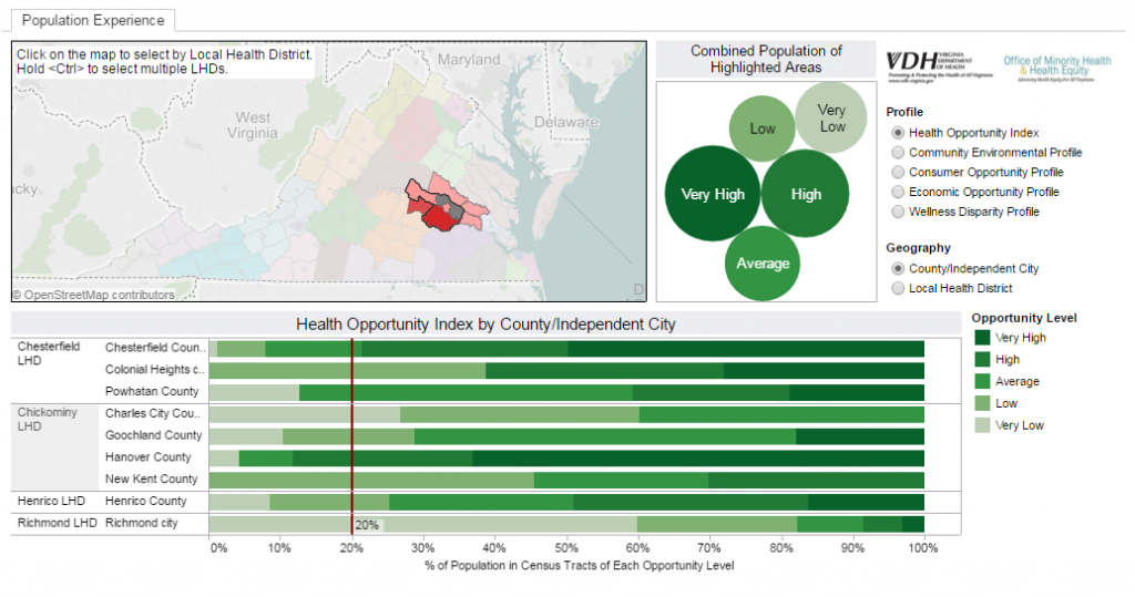
The dashboard consists of three parts: the map in the upper left corner, a bubble chart to its right, and bar charts in the lower part of the dashboard.
Using the Map
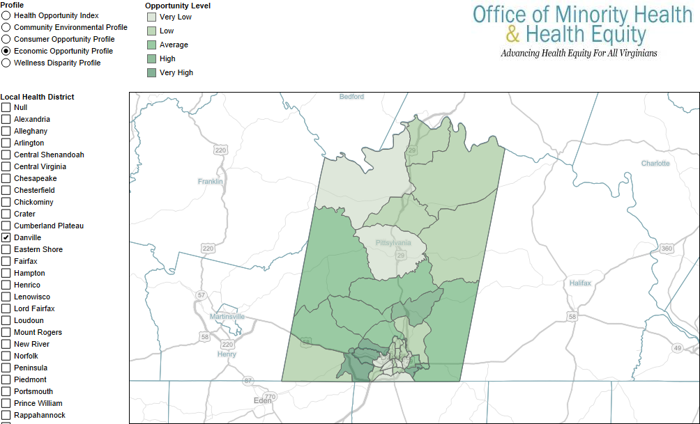
The map shows Virginia’s 134 counties and independent cities colored by Local Health District (LHD). Hover the cursor over a locality in the map to reveal the name of the locality and its LHD. Hovering the cursor over the map area also reveals a map toolkit on the left side of the map. You can use this tool to zoom in, zoom out, or to return to the “home” view. Hover over the right arrow at the bottom to reveal advanced zooming and selection tools. You can use these tools to zoom into specific areas of the map or to select groups of localities. To pan the map, click and hold the left mouse button. This allows you to “grab” the map and move it around in the frame. Click on a locality to select its LHD. You can select multiple LHDs by holding the [ctrl] or [cmd] key. Selecting LHDs in the map affects all areas of the dashboard.
The Bubble Chart
The bubble chart to the immediate right of the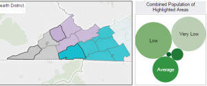 map shows the proportion of the population in the selected LHD(s) that live in census tracts at each opportunity level (very low, low, average, high and very high). Hover over each bubble to see detailed information on the selected population. The dashboard default has all LHDs selected, so
 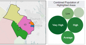 the population in the bubbles represent all of Virginia. Select different LHDs to explore the distribution of the population in census tracts in each opportunity level. The two examples to the right, for instance, show the wide variation between Southwest and Northern Virginia in the Virginia HOI.
The Bar Chart
The bar chart at the bottom of the dashboard displays similar information to the bubble charts. However, this chart shows a single bar for each county within each LHD. Select one or more LHDs in the map to limit the display to your desired LHDs. Hovering over the bars reveals detailed information for each county at each opportunity level. The vertical red line is the 20% marker–where the “very low” opportunity bar would reach if opportunity was spread evenly among localities.
The Selection Buttons
Use the radio buttons in the upper right corner of the dashboard to cycle between the Virginia HOI and its four profiles. You may also choose to view data at the Local Health District or County/Independent City level in the bar chart. This allows quick comparisons among LHDs.
A Closer Look
By scrolling down to the next dashboard you can view the Virginia HOI and its profiles at the census tract level. Click on the radio buttons in the upper left hand corner to scroll through the Virginia HOI and its four profiles. To select individual LHDs or groups of LHDs, use the check box list to the left of the map. Before selecting, deselect the “All” check box to clear the selections. The map will zoom to the selected entities. Alternatively, you may use the map toolkit as described above.